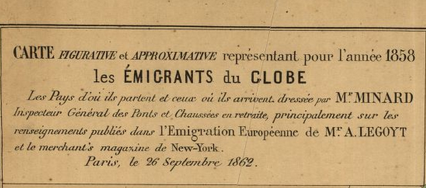
Dans le titre de la carte : « Carte figurative et approximative représentant... » : Comment mieux le dire ? :)
What We Can Learn From a Vintage Visualization of Global Migration - CityLab
►http://www.citylab.com/work/2014/11/international-migration-patterns-from-1858/382524
Earlier this year, CityLab’s John Metcalfe wrote about Austrian researchers who created a beautiful visualization of global migration patterns:
By extrapolating from United Nations data, they discovered that the percentage of the world’s population that’s moved over 5-year periods hasn’t changed much since 1995. They also found there are hot spots where massive migrations are taking place, chiefly from Latin to North America, between South and West Asia, and all around inside Africa.
But what if we went back another 150 years, to 1858? A French archival map, courtesy the Library of Congress, traces where people were coming from and where they were headed at that time. The map reveals some striking similarities, as well as some notable differences from global migration patterns today.